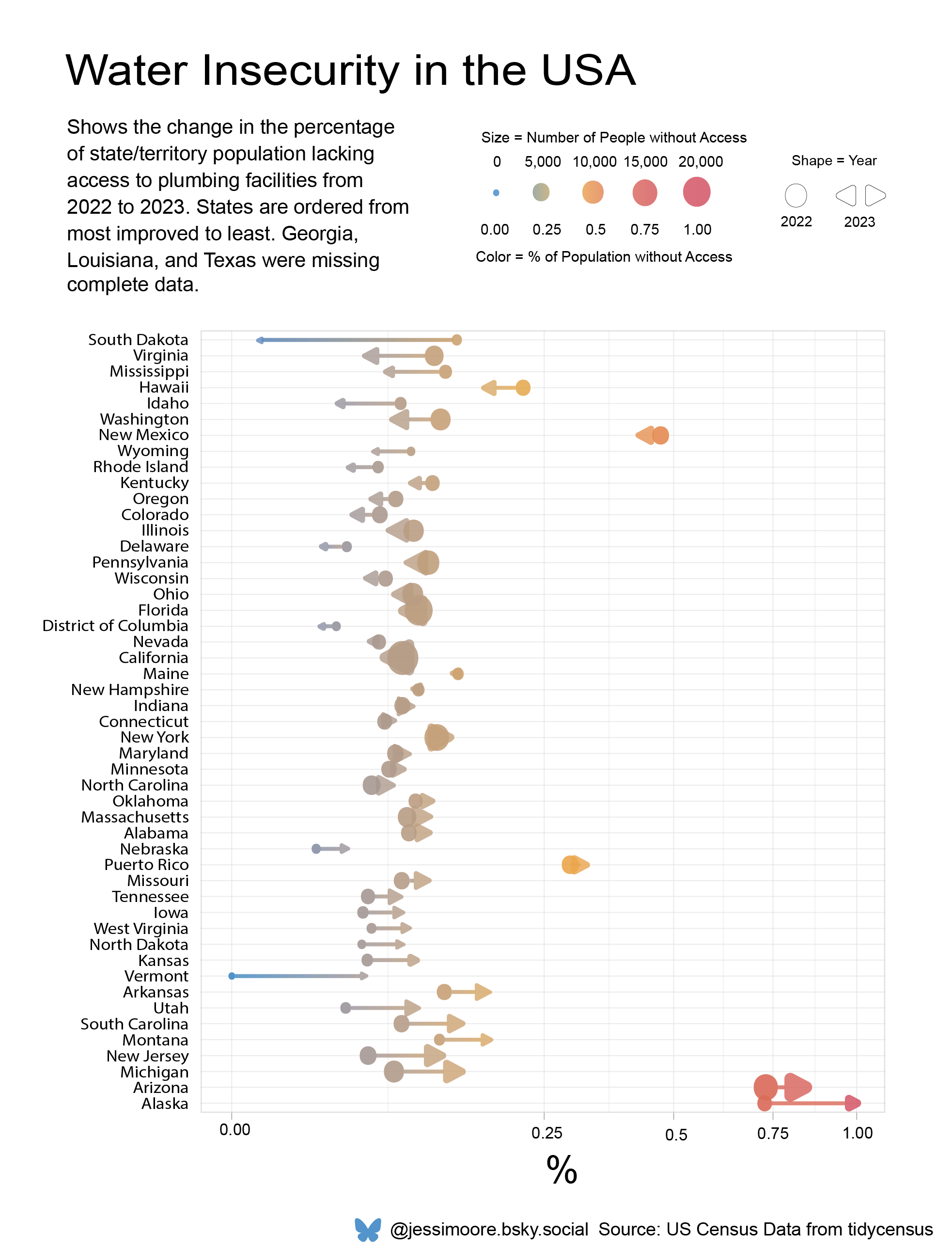
Tidy Tuesday: Water Insecurity
My submission for week 4 of Tidy Tuesday, 2025 - an enhanced dumbbell plot. My code for the initial plot, created in R, is detailed below the image.
R Code:

# load packages:

library(forcats)
library(dplyr)

# load the data:

tuesdata <- tidytuesdayR::tt_load(2025, week = 4)

water_insecurity_2022 <- tuesdata$water_insecurity_2022
water_insecurity_2023 <- tuesdata$water_insecurity_2023

# organise the data:

water_ins_22 <- water_insecurity_2022 %>%
  separate_wider_delim(name, ", ", names = c("county", "state")) %>%
  group_by(state) %>%
  summarise(avg_pct = mean(percent_lacking_plumbing),
            people_lacking_plumbing = sum(plumbing)) %>%
  mutate(year = 2022)

water_ins_23 <- water_insecurity_2023 %>%
  separate_wider_delim(name, ", ", names = c("county", "state")) %>%
  group_by(state) %>%
  summarise(avg_pct = mean(percent_lacking_plumbing),
            people_lacking_plumbing = sum(plumbing)) %>%
  mutate(year = 2023)

water_ins <- bind_rows(water_ins_22, water_ins_23) %>%
  group_by(state) %>%
  mutate(pct_diff = avg_pct[year==2022] - avg_pct[year==2023]) %>%
  drop_na() %>%
  mutate(gradient = sqrt(avg_pct))

segment <- water_ins %>% # used to create the segments on the plot
  select(state, avg_pct, year) %>%
  pivot_wider(names_from = year, values_from = avg_pct) %>%
  rename(avg_pct_22 = "2022",
         avg_pct_23 = "2023")


# create the plot:

p <- ggplot() + \\
  geom_segment(data = segment,
               aes(x = state, y = avg_pct_22,
                   yend = avg_pct_23, color = avg_pct_23),
               alpha = 0.8, size = 0.6) +
  geom_point(data = water_ins %>% filter(year == 2023),
             aes(y = avg_pct, x = fct_reorder(state, pct_diff),
                 color = gradient,
                 size = people_lacking_plumbing,
                 ), shape = 17, alpha = 0.6) +
  geom_point(data = water_ins %>% filter(year == 2022),
             aes(y = avg_pct, x = fct_reorder(state, pct_diff),
                 color = gradient,
                 size = people_lacking_plumbing),
             alpha = 0.6) +
  scale_color_gradient2(low = "#3f88c5",
                        mid = "#edae49",
                        high = "#d1495b",
                        midpoint = 0.5) +
  scale_y_sqrt() +
  guides(alpha = "none") +
  coord_flip() +
  labs(y = "% of Population Lacking Plumbing Facilities",
       x = NULL,
       size = "Population Lacking \n Plumbing Facilities",
       title = "Water Insecurity in the United States") +
  theme_light() + \\
  theme(legend.position = "bottom")
p

# from here, I edited the plot in Illustrator.