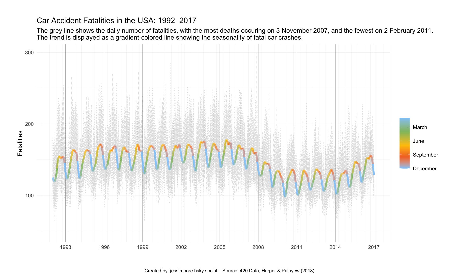
Week 16 of Tidy Tuesday looks at data on fatal car accidents in the USA and whether more deaths occur on 20th of April (the 420 Cannabis holiday). I made a line plot showing the change in number of fatalities over time, and decided to emphasise the seasonality by adding a colour gradient to the trend line.
I discovered that geom_smooth() does not support gradients, but you can get around this by manually creating the loess (locally estimated scatterplot smoothing) using l <- loess(fatalities_count ~ as.numeric(date), data = daily_accidents, span = 0.02). This can be added as a variable in the data frame using mutate(smooth = predict(l)) and then plotted as a normal geom_line() in ggplot2.
To change the colour of the line, I specified geom_line(aes(y = smooth, color = months, group = 1)). Having group = 1 tells ggplot2 that I only want one line with multiple colours, rather than multiple lines each with their own colour. Then, scale_color_gradientn() is used to add the colours.
The full code is below.
Code
tuesdata <- tidytuesdayR::tt_load(2025, week =16)daily_accidents <- tuesdata$daily_accidentsdaily_accidents_420 <- tuesdata$daily_accidents_420library(ggplot2)library(dplyr)library(lubridate)l <-loess(fatalities_count ~as.numeric(date), data = daily_accidents, span =0.02)accidents2 <- daily_accidents %>%mutate(smooth =predict(l),months = lubridate::month(date)) %>%arrange(date)t <-"Car Accident Fatalities in the USA: 1992–2017"st <- glue::glue("The grey line shows the daily number of fatalities, with the most deaths occuring on 3 November 2007, and the fewest on 2 February 2011. The trend is displayed as a gradient-colored line showing the seasonality of fatal car crashes.")cptn <-"Created by: jessimoore.bsky.social Source: 420 Data, Harper & Palayew (2018)"p2 <-ggplot(accidents2, aes(x = date)) +geom_line(aes(y = fatalities_count),alpha =0.2, linetype ="dotted",color ="grey40") +geom_line(aes(y = smooth, color = months,group =1), linewidth =1.5) +scale_color_gradientn(colors =c("#90caf9","#f3722c","#ffc400","#90be6d", "#90caf9"),values = scales::rescale(c(1,3.5,6,9,12)),labels =c("January", "March", "June", "September", "December"),transform ="reverse") +scale_x_date(date_breaks ="3 years", date_minor_breaks ="6 months",date_labels ="%Y") +labs(x =NULL, y ="Fatalities",color =NULL,title = t, subtitle = st, caption = cptn) +theme_minimal() +theme(panel.grid =element_line(linewidth =0.15),panel.grid.major.x =element_line(linewidth =0.2, color ="grey60"),plot.margin =margin(30,30,30,30),plot.caption =element_text(size =8, hjust =0.5, vjust =-15),plot.caption.position ="plot")